Most VPN applications fall into two extremes: visually overloaded interfaces that feel slow and confusing, or poorly designed tools that lack clarity and trust. Many either overwhelm users with irrelevant information or provide almost no feedback at all, reducing confidence in the connection.This personal project was created as a learning exercise to explore how clarity, structure, and restraint can improve user experience in a utility-driven product.
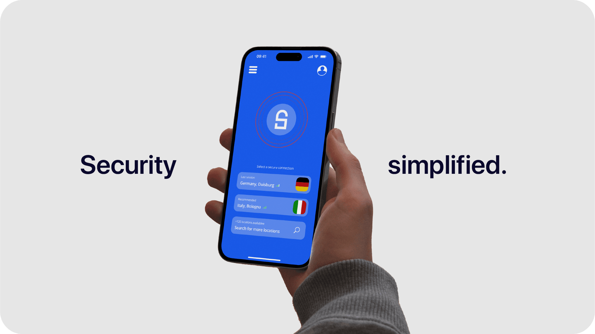
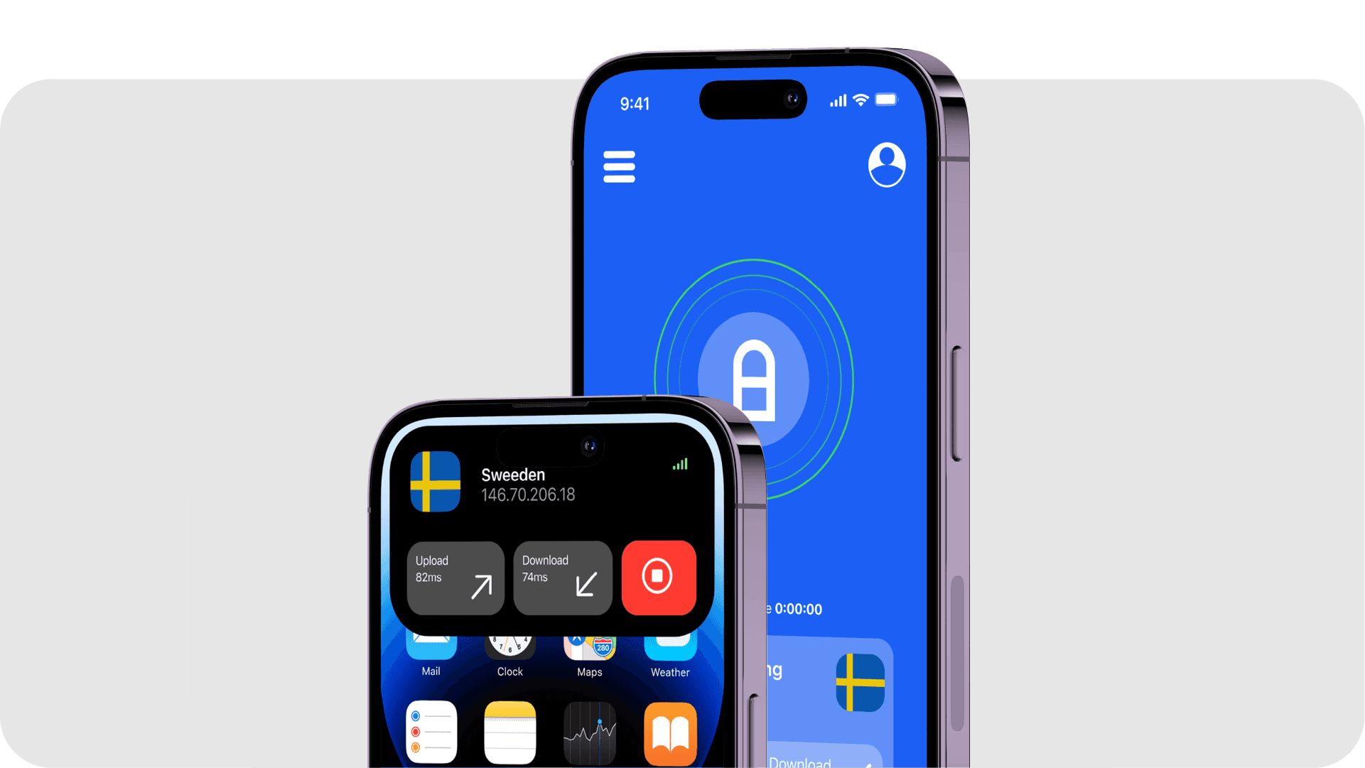
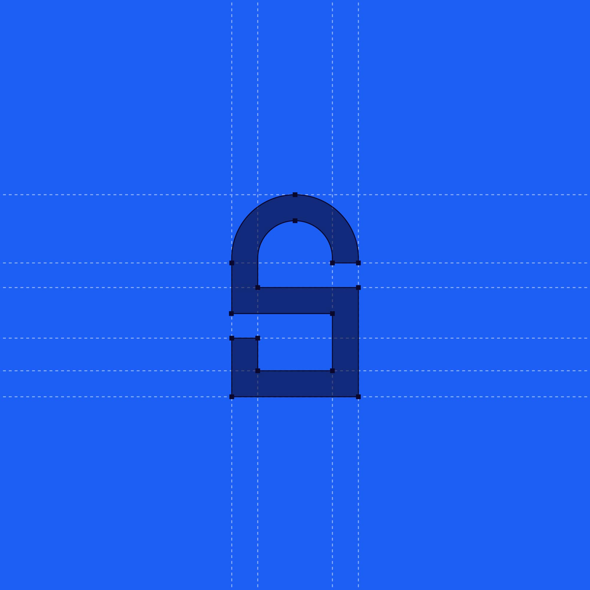
Secure VPN was designed around the idea of “just enough information.” The interface prioritizes speed and ease of use, recognizing that users typically spend only a few seconds inside a VPN app. A minimal color palette, clear hierarchy, and one-click connection flow reduce friction, while still providing essential feedback such as server location, ping, and upload/download status.The visual system extends from the logo into the interface through subtle motion and consistent typography, creating a cohesive experience without unnecessary decoration. The result is a simple, transparent VPN concept focused on usability, trust, and efficiency.