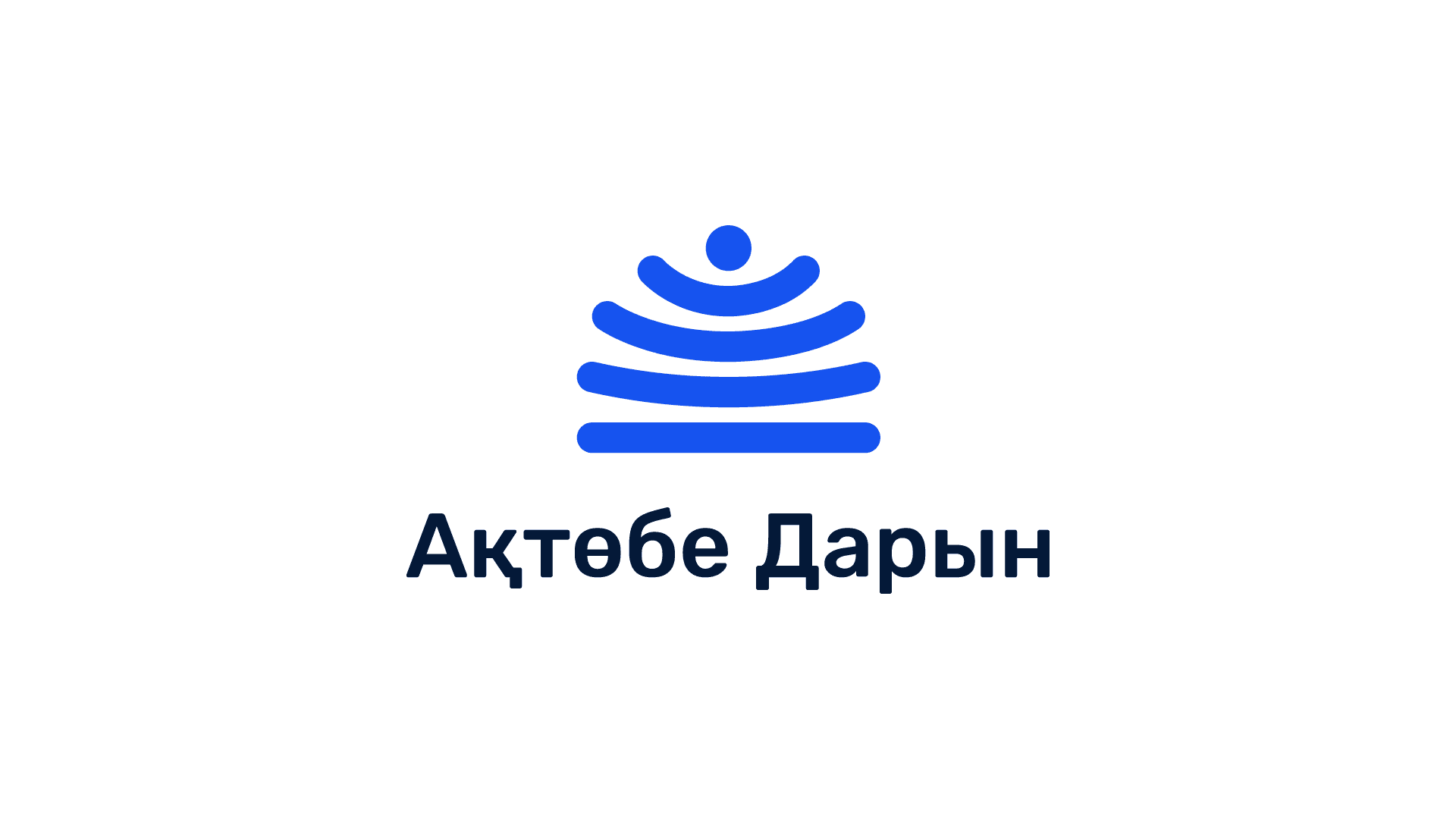
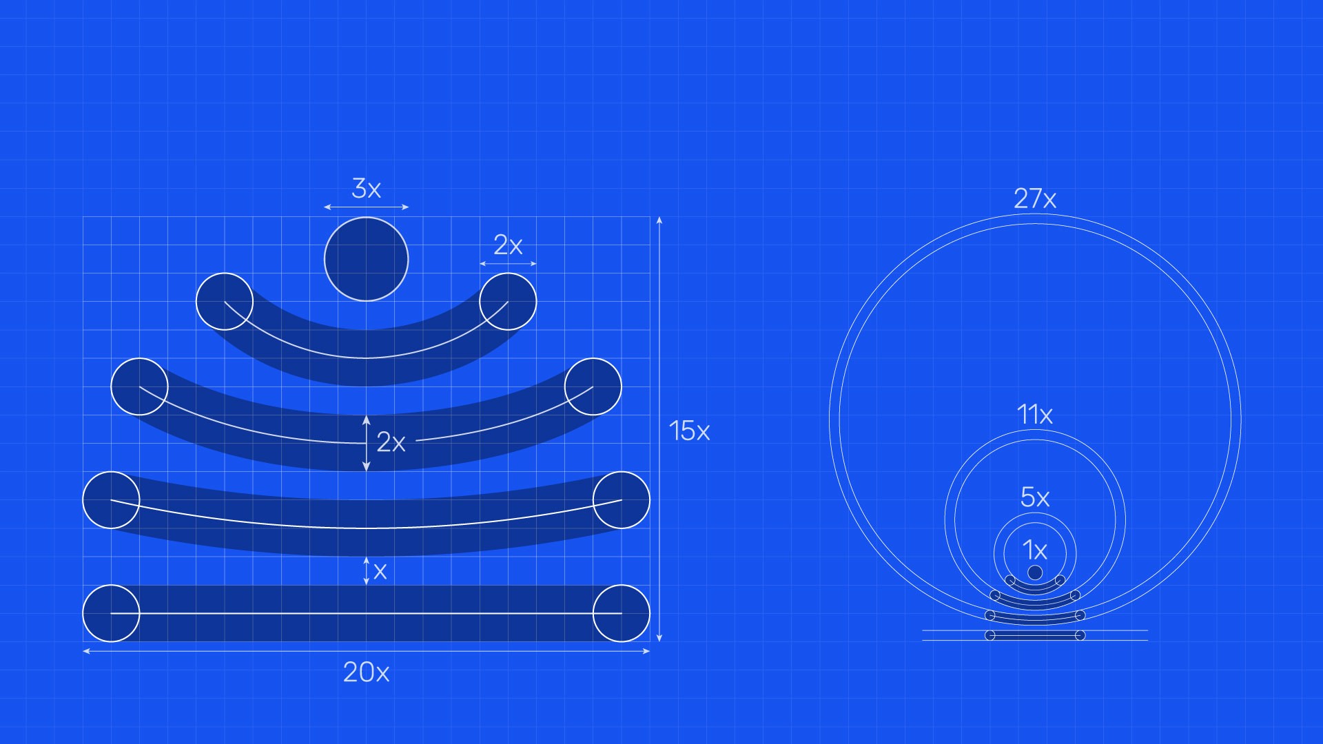
The previous logo and visual presence were outdated, inconsistent, and lacked a clear system. I developed a new identity from the ground up, starting with a logo designed to be meaningful, scalable, and future-proof. The form references an open book, where the spread pages create a stable base and a circular top, suggesting both knowledge and a child’s head with open arms. Rounded shapes and soft geometry establish a sense of safety and openness, appropriate for a student-focused institution.
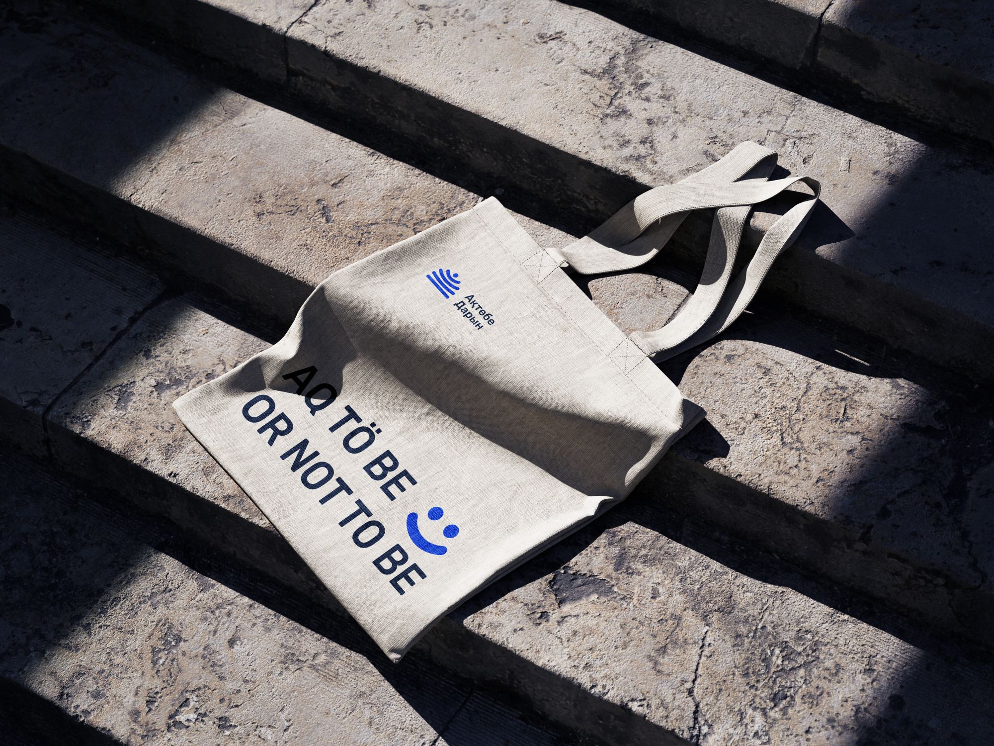
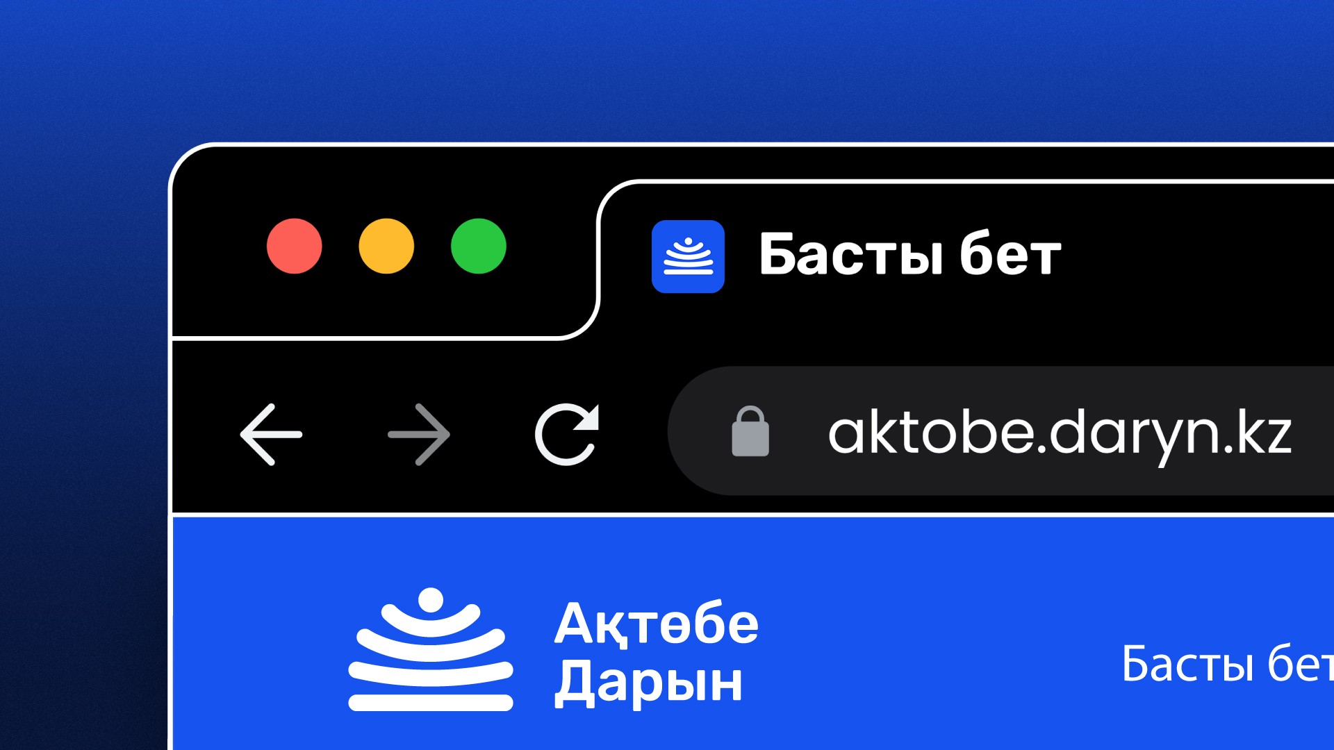
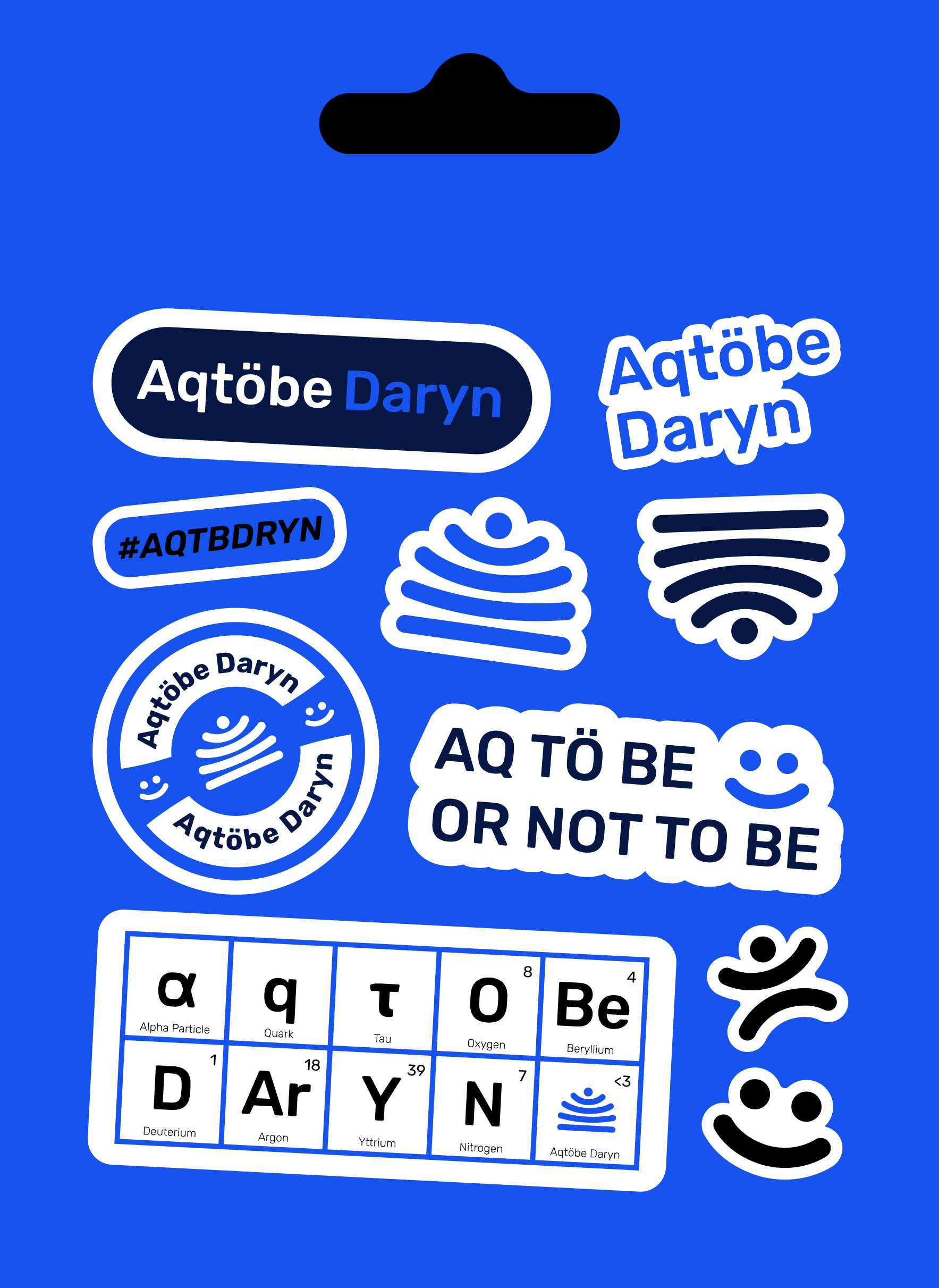
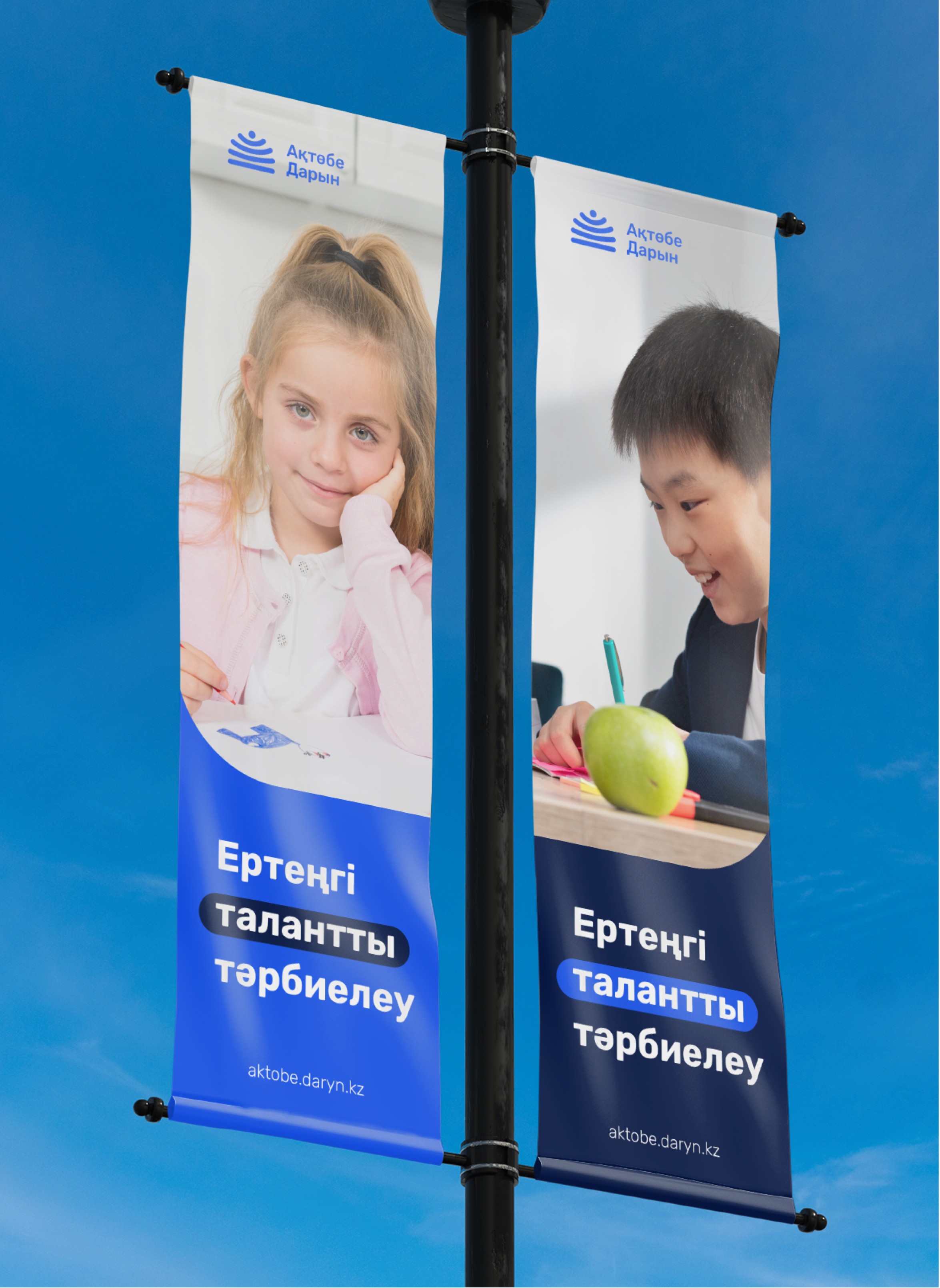
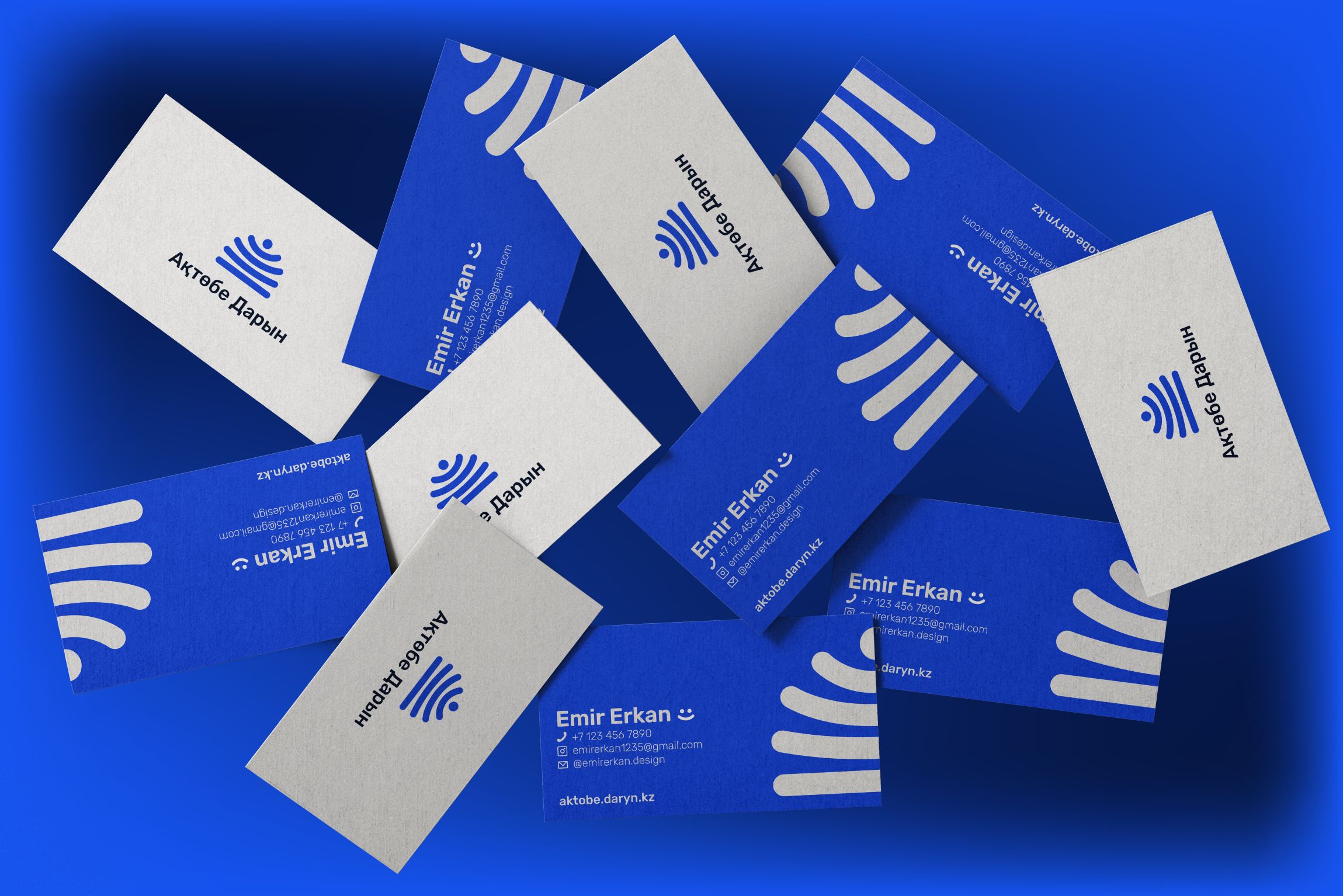
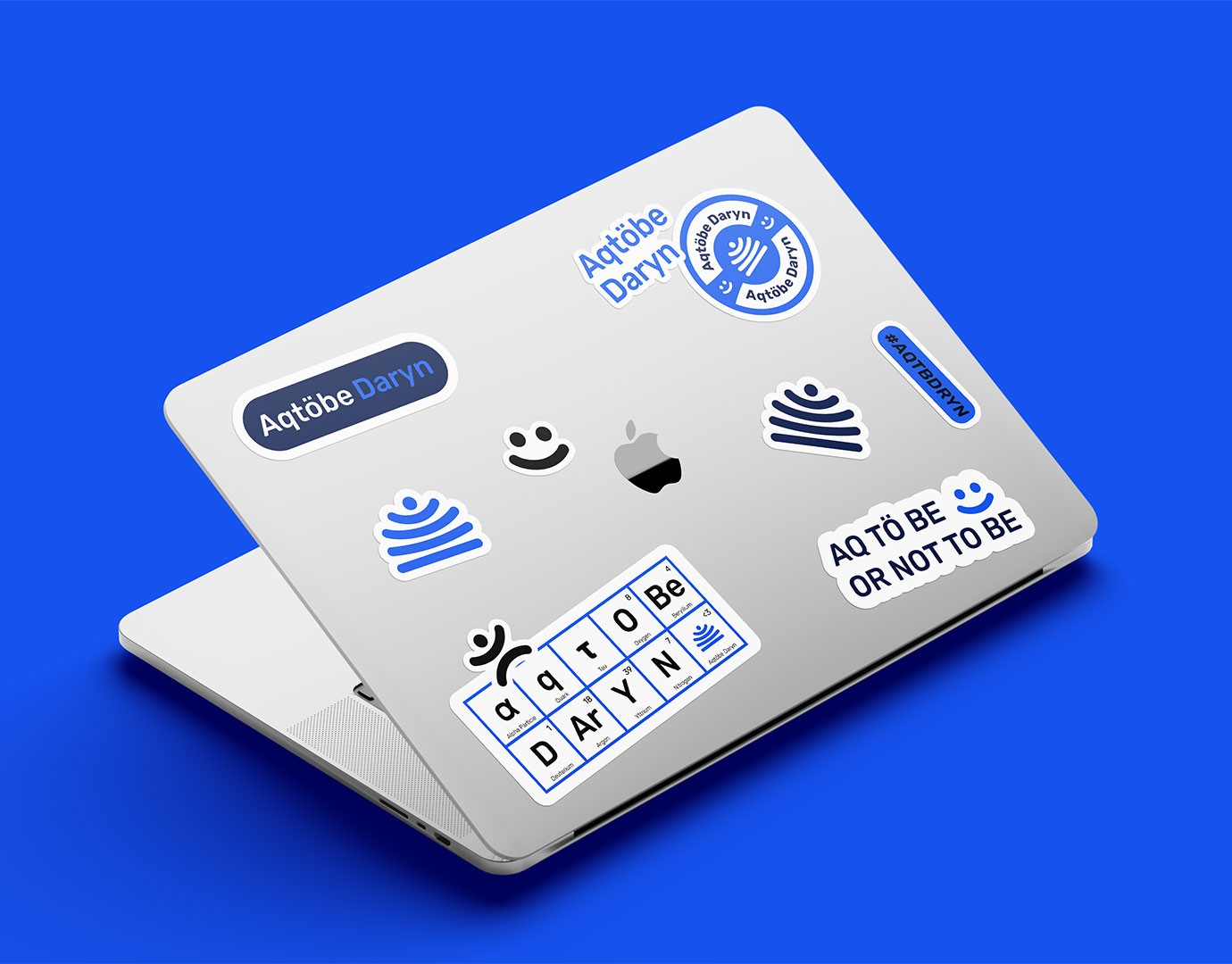
The identity was designed as a flexible system rather than a single mark, allowing it to extend naturally across certificates, medals, stationery, stickers, and digital media. The new visual language was immediately embraced by the board and is now actively used across all official materials. Today, the logo functions as a recognizable symbol of Aktobe Daryn, visible in everyday academic life and closely associated with the institution by students and the local community.